If a call to action (CTA) is missing from your copy or content, you could be missing out on leads or conversions. Let’s look at some options for adding or strengthening your content CTAs.
NOTE: This is part 8 in a ten-part serialisation of my eBook. Please read the introduction first if you are new to the tool.
It’s hard to think of a reason NOT to have a call to action (CTA) in every piece of copy and content. Will including one bring in thousands of enquiries, every time? Of course not, but it makes sense to always give people a reason to get in touch and a way to do it.
Auditing for calls to action is relatively simple:
Is there a CTA?
The easiest question in the whole of this audit tool!
Does the CTA make sense in the context of the piece?
Good CTAs often reflect where the reader is in the relationship cycle. If the content is likely to be one of the first places they come to, and you offer an expensive or high-involvement purchase, you may want to avoid a ‘buy now’ CTA. A ‘learn more’ CTA might be better.
Is the CTA wording compelling?
Does it do any of these:
-
Offer a free trial.
-
Give them great benefits of clicking.
-
Make it clear that clicking means they get something instantly.
-
Build their curiosity.
-
Suggest that not clicking means missing out on something.
-
Or compel them to click for any other reason?
Is it done via a CTA button?
Pretty much all the A/B testing I’ve seen found that a CTA button gets more responses than a standard text CTA. That may in part be because mobile devices are commonplace and buttons are easier to click than text links on small screens.
Some solutions for ‘call to action’ problems
A very simple solution, which should be the minimum for every page of content online, is to have a CTA at the bottom of the page. Something like this:
If you would like more information about the content covered on this page, please contact us.
But why be so dull? If you are writing a CTA for a page why not use it as an opportunity to come up with something more engaging? Like this:
The information on this page is just a taste of what our experts can bring to your business. Get in touch with our team of boffins at experts@ABCcompany.com if you need any help or info (go on, we won’t bite).
If you write three or four different CTAs they can cover most circumstances and be recycled across multiple pages.
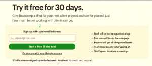
At Basecamp.com they are always tinkering with their CTA buttons. Sometimes it’s a 30-day trial, sometimes it’s 60 days, but there always seems to be a risk-free offer.

They also work hard to integrate the button into a much bigger CTA mechanism and message, like this:

Here’s a list of copy for ten CTA buttons to consider as a starting point for developing your own:
-
Subscribe.
-
Sign up.
-
Join.
-
Get started.
-
Count me in.
-
Yes please.
-
Give it a try.
-
Send me more info now.
-
Take me to the good stuff.
-
Get a demo.
This example from Bark.com asks for a postcode, which is a nice soft entry into their conversion funnel:

Another device worth adding is an arrow drawing the user’s eye to the CTA, like Socialmediaexaminer.com have done here:


